Disease Tracker
A downloadable app
This is an intelligent mobile app designed in Figma. The design goal was to practice applying Parasuraman levels (agency), Horvitz Act/Ask/Wait model (proactivity), OPD (collaboration), and SA levels (context-awareness).
The downloadable PDF shows how the app was later redesigned with ethics in mind using the Value Sensitive Design model (which includes identifying stakeholders, determining value tensions, doing a five-principle analysis, and creating a concrete failure scenario before redesigning).
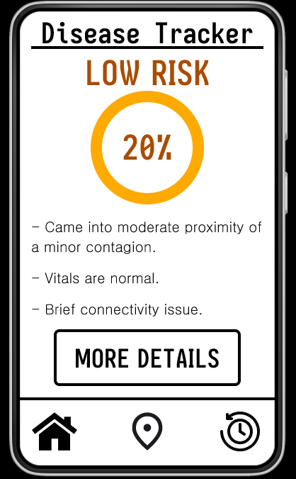
My design is for an app that tracks the user’s vitals and relative location to other people to determine the likelihood that the user will contract a severe disease or become severely contagious. I chose this domain, because I was thinking about how useful it would be for the public to have easier access to information about the spread of a disease in order to mitigate its spread in the community. The stakes are real and specific, as the app will affect the user’s choices regarding the health of themselves and others. The stakes are especially high for deadly and contagious diseases, as well as for people vulnerable to illness.
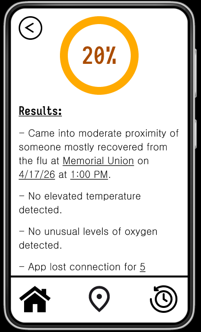
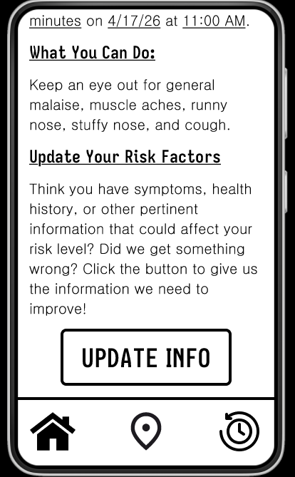
I found it most difficult to design collaboration in the app, as I wanted the app to work for people with a wide range of goals. Some users might focus on protecting their own health, others might focus on protecting the health of a vulnerable loved one, and still others might focus on protecting the health of the general public. These goals may even vary over time. What I settled on was including a way to update the information, which would include the goals of the user and important personal health details. I similarly felt tension occur between the system having high agency and the user having more control, especially in regards to the interpretation of raw data. It was a struggle to know how to resolve a dispute between what the user thinks the risk is and what the system thinks the risk is. I wanted the user to have control over the interpretation if the system is wrong, but I also did not want the user to be able to skew the system’s perception incorrectly (since people are known to worry about having a disease they do not have). Thus, I decided the user could give more information about their symptoms and context that the system could not measure to have some more control.
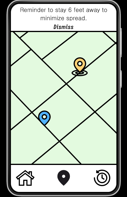
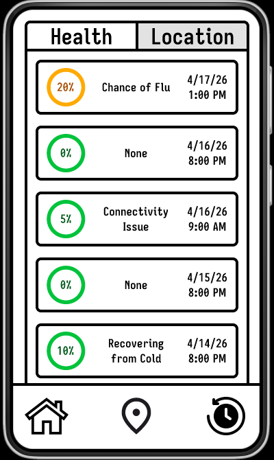
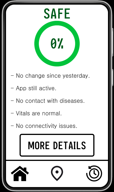
My design applies all context dimensions (physical environment, user state, social context, task context, temporal context, and device/platform). When the user is at a lower risk, the system tracks the user’s location relative to other people to determine whether the user is heading to a place they could catch a disease. When the user is at a higher risk, the system warns the user when they are nearing one of the people they would like to protect or nearing an environment that could worsen their risk. Similarly, at higher risk, the system switches from simply monitoring signs of increasing risk to also monitoring signs of decreasing risk and will notify the user of changes immediately rather than waiting for a time that is convenient for the user. The context dimension that drove the most significant adaptations was the social context, as the app is intended to track disease within a society. Additionally, other contexts like physical environment and temporal context are mostly used to determine the social context of who the user was with by tracking where the user is and when they were there.
When my system is wrong, the user must recognize the error and explain to the system why they think the system made an error, as well as give any other revealing information. Unfortunately, I could not think of a way for the system to consistently catch its own error, which is problematic for users who are not experienced in differentiating severe and mild symptoms. This would make it hard for those users to fix the problem. I am fairly confident, however, that the system will be flexible to receive user input.
If I had another week, I would flesh out the design of the update page, as much of my design concerns stem from how the user and system will be able to interact and influence each other. I would determine all of the important areas to update (such as current user goals, health history, and symptoms) and also find a way for the user to give other information they think is pertinent.
Color Palette Contrast
Safe Main: 01C33B
Safe Dark: 005A1B (for text against white)
Safe Light: 8DFFAF (for background color against black)
Low Risk Main: FFAA00
Low Risk Dark: AA4C00 (for text against white)
Low Risk Light: FFD175 (for background color against black)
High Risk Main: FF0000
High Risk Dark: 81001C (for text against white)
High Risk Light: not used
Safe Dark vs White — 8.47:1
Safe Light vs Black — 17.05:1
Low Risk Dark vs White — 5.61:1
Low Risk Light vs Black — 14.62:1
High Risk Dark vs White — 10.76:1
Download
Leave a comment
Log in with itch.io to leave a comment.